Insights into curating Innovative Forms: The Lettering of John Skelton

To mark the reopening of the Lettering Arts Trust’s gallery at Snape Maltings we invited John Skelton’s daughter, Helen Mary to offer a personal insight into curating ‘Innovative Forms – The Lettering of John Skelton’. This exceptional exhibition has been extended until 29th August 2020.
Seven years ago the Lettering Arts Centre invited the Skelton family to mount an exhibition of my father, John Skelton’s lettering. We were delighted that here was an opportunity to explore and celebrate the inventive approaches with which John undertook commissions.
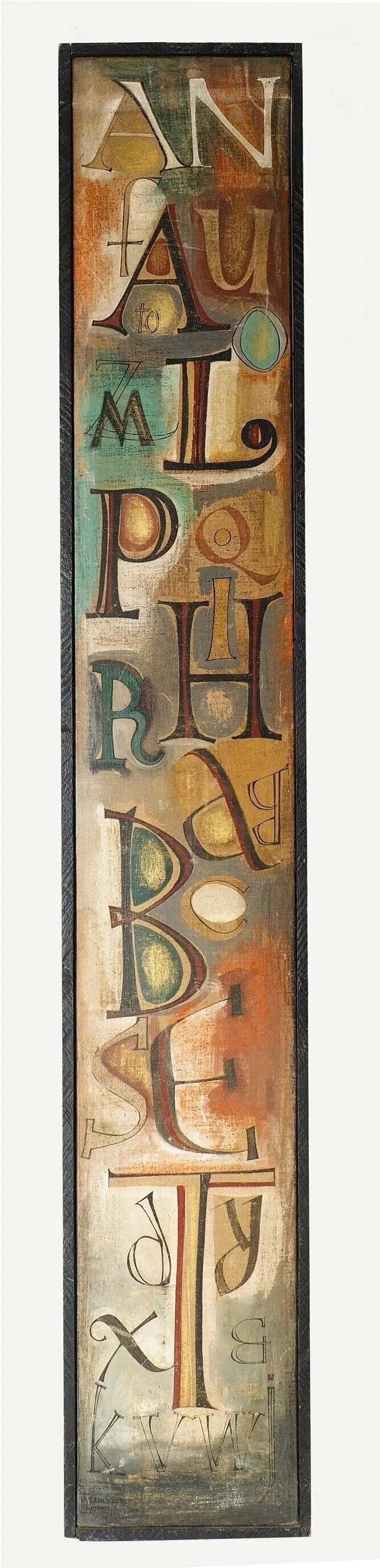
Canvas Alphabet, Oil paint on canvas, 1970s
For various reasons the preparations for this exhibition were delayed, but two years ago everything looked set to go ahead. A colleague counselled me that ‘Title is key’. She was right...... this maxim enabled us to distil our choices and to ask ourselves ‘does this work display innovation? Since John was such a prolific artist, it was essential to have a simple measurement in order to be able to discard some important but perhaps more serviceable pieces. The enormous body of work John produced over a period of 55 years was achieved by his excitement of the project in hand, and by the sheer number of hours he worked, often pouring over designs late into the night and always rising early.
I had not really appreciated the extent and variety of his archive until I embarked on regular visits to The Keep, the archive facility in Brighton where his drawings, designs and rubbings reside. Over nine months I explored my father’s work and became amazed at his boundless energy. Some years he achieved up to fifty substantial pieces of work with the help of his apprentices, alongside several sculptures and letter cutting pieces which he prepared for exhibitions, not to mention the countless watercolours he had on the go. These became very popular and always sold out when exhibited.
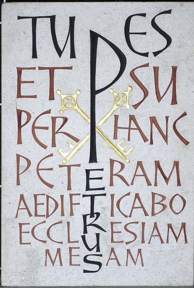
Tue es Petrus, Hopton Limestone, 1986
John kept records of most of the commissions he was involved with, and also of speculative sculptural and lettering pieces. He recorded these in what became known as ‘the black book’. This document has been enormously helpful as a reference throughout the preparations of this exhibition, and enabled invaluable cross referencing and verifications which has assisted our tireless team of dedicated helpers. Framing costs, difficulties in conservation and the need to fit the exhibition into the space available all dictated my choices. Also some designs or drawings were sensitive in some way and therefore,
although wonderful examples of innovation, were not suitable to be chosen.
There are thirty three framed drawings or rubbings within the exhibition and five panels illustrating important projects that John and his assistants were involved with. On display also are fourteen exhibits which have been kindly loaned for this exhibition and four display cases of fascinating artefacts and letters.
Having been fortunate enough to receive an Arts Council grant and enthusiastically supported by the Lettering Arts Trust, this exhibition has also been made possible by generous donations of several individuals. Also, I decided to retire from taking commissions and therefore have been able to devote this last year to exhibition research and preparation. Through this experience I have gained all-round by getting more familiar with my father’s output and by learning some archival skills.
The aspiration of ‘Innovative forms - the Lettering of John Skelton’ is to inspire and enthuse both students and masters of letter carving , and to draw attention to the vitality of John’s work and his important place in the twentieth century’s letter carving cannon.
Helen Mary Skelton (May 2020)

'Ditchling Cat.' by John Skelton. Rosewood. 1970's